Brand Guidelines
Smart Organics Brand Guidelines
This guide ensures consistent and professional use of the Smart Organics identity across all communication platforms.
Consistent branding is crucial to building recognition and trust. These guidelines define how to correctly use our logo, colors, typography, and imagery in all marketing materials, presentations, and digital platforms.
Following these guidelines ensures that Smart Organics maintains a consistent, recognizable, and professional brand image across all touchpoints.
Logo Usage
Approved logo variations and usage rules for all platforms.
Primary Logo — 3D
Primary Logo — Flat
Logo on Dark Background
Minimum Clear Space
To ensure the logo maintains its visual impact and legibility, maintain a minimum clear space around the logo equal to the height of the letter "S" in "Smart". This space should be free of any text, graphics, or other visual elements.
- Minimum clear space on all four sides
- No text or graphics within the clear space
- Minimum size: 120px width for digital, 30mm for print
Logo Do's and Don'ts
Use the logo on white or light gray backgrounds for maximum visibility and clarity.
Maintain the original aspect ratio when resizing. Always scale proportionally.
Use approved color variations only: full color, flat, or on dark backgrounds.
Don't stretch, distort, or rotate the logo. It must always appear in its original proportions.
Don't change the logo colors or apply unapproved effects, shadows, or filters.
Don't place the logo over busy images or patterns that reduce its legibility.
Brand Colors
Our carefully curated color palette ensures consistent brand recognition.
Organic Green
HEX: #1F6B3A
RGB: 31, 107, 58
CMYK: 71, 0, 46, 58
Harvest Yellow
HEX: #F2B705
RGB: 242, 183, 5
CMYK: 0, 24, 98, 5
Deep Green
HEX: #124A2C
RGB: 18, 74, 44
CMYK: 76, 0, 41, 71
Neutral Gray
HEX: #F4F4F4
RGB: 244, 244, 244
CMYK: 0, 0, 0, 4
Color Usage Recommendations
Should dominate primary communication, headers, and brand elements.
Should highlight key messages, CTAs, and interactive elements.
Create visual balance and ensure readability with clean backgrounds.
Typography
Our type system ensures readability and brand consistency across all media.
Primary Font
Montserrat
ABCDEFGHIJKLMNOPQRSTUVWXYZ
abcdefghijklmnopqrstuvwxyz
0123456789
Used for: Headings, titles, website navigation, corporate presentations
Montserrat provides a clean, modern, and professional appearance ideal for high-impact text elements.
Secondary Font
Open Sans
ABCDEFGHIJKLMNOPQRSTUVWXYZ
abcdefghijklmnopqrstuvwxyz
0123456789
Used for: Body text, reports, documents, marketing materials, website content
Open Sans ensures excellent readability across digital and print media, making it ideal for longer text content.
Accent Font
Playfair Display
ABCDEFGHIJKLMNOPQRSTUVWXYZ
abcdefghijklmnopqrstuvwxyz
0123456789
Used for: Promotional materials, coffee branding campaigns, special marketing
This serif font adds a premium feel suitable for coffee branding and storytelling applications.
Type Hierarchy Example
Heading 1 — Montserrat Bold
Heading 2 — Montserrat Semibold
Heading 3 — Montserrat Medium
Heading 4 — Montserrat Medium
Body text uses Open Sans at regular weight for maximum readability. This is the standard typeface for all paragraph text, descriptions, and general content throughout the website and marketing materials.
"Accent text uses Playfair Display for premium storytelling."
Brand Imagery & Photography
Visual guidelines for authentic, on-brand photography and imagery.
Recommended Imagery Themes
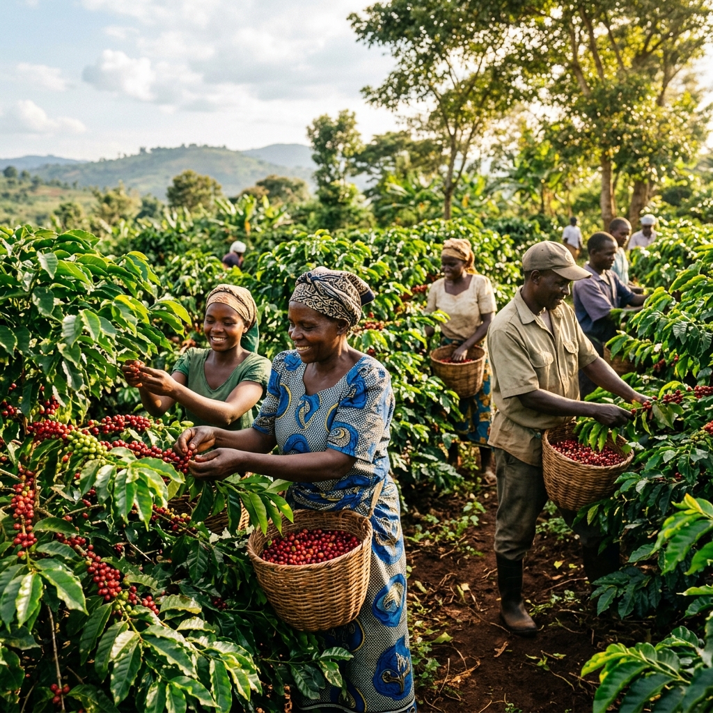
Photography Style
- Natural lighting — avoid artificial/studio setups
- Authentic farm environments — real locations
- Warm, earthy tones — consistent color grading
- Real farmers and field activities — not stock models
Icon Style
Clean, minimal line-style icons in green tones for consistent visual communication.
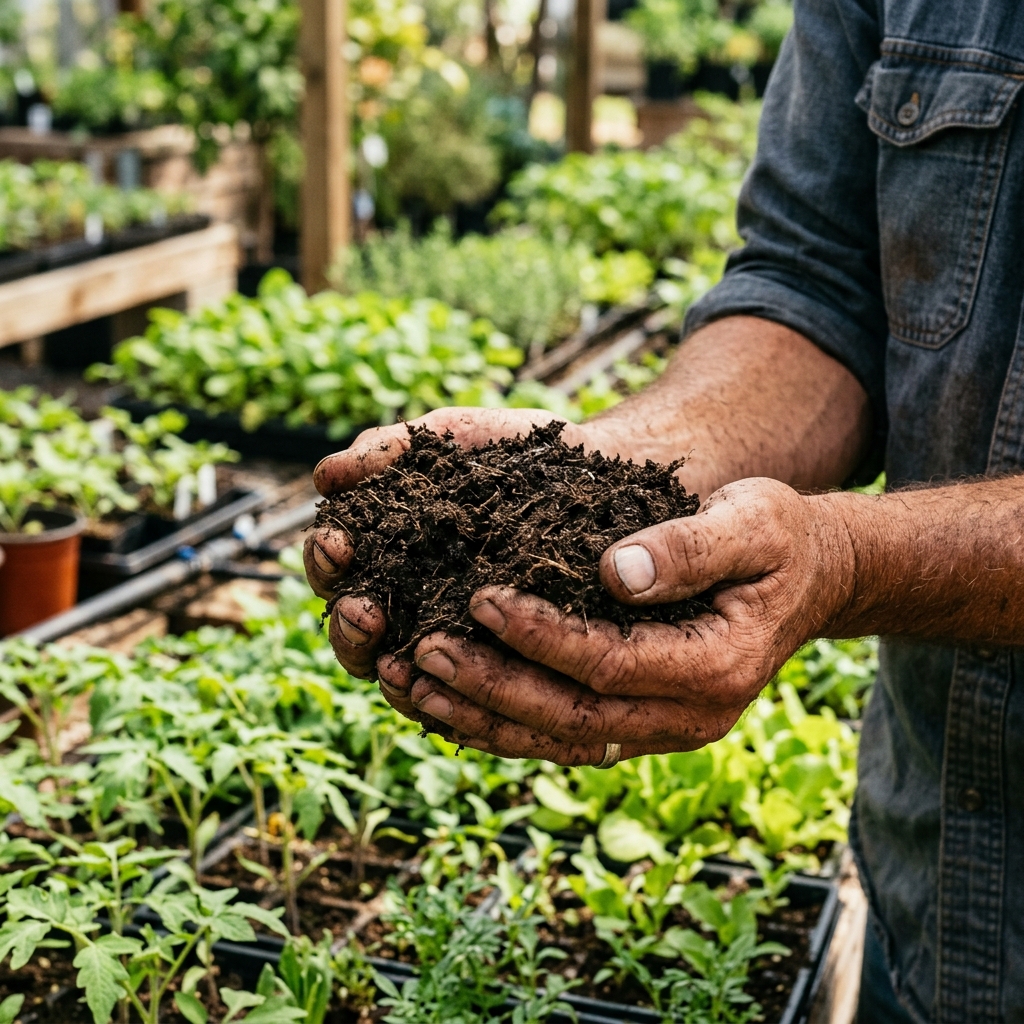
Organic Farming
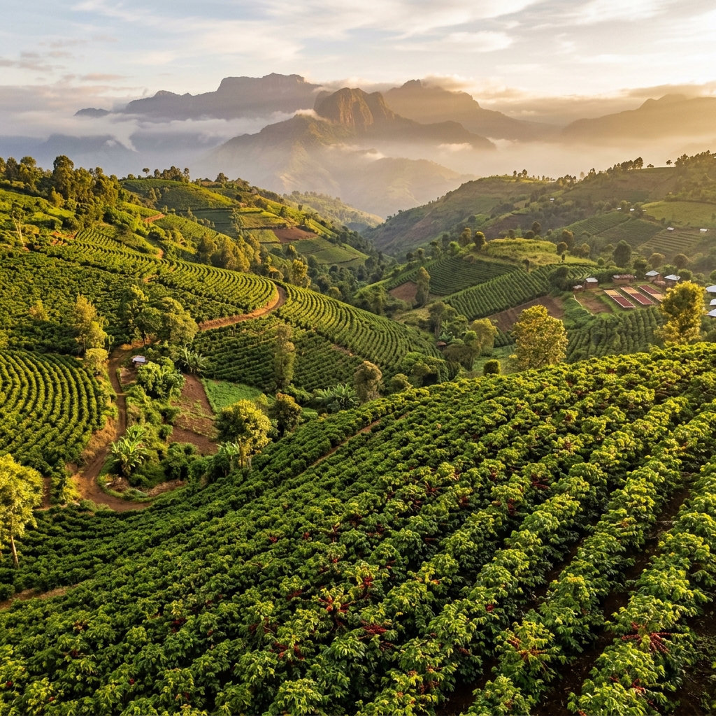
Coffee Farming
Agri Inputs
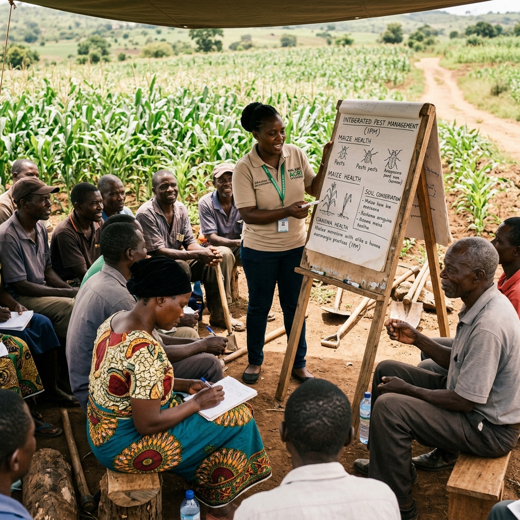
Training
Distribution
Sustainability
Video Assets
Video content strengthens communication with farmers, partners, and investors.
-
Company Introduction
Brand story and mission overview for website and social media
-
Contract Farming Program
Program overview for farmer recruitment and onboarding
-
Farmer Training & Extension
Field demonstrations and training session recordings
-
Product Demonstrations
How-to videos for seedling planting and organic manure application
-
Farmer Success Stories
Testimonial videos for social media and investor presentations
Presentation Deck
Corporate presentation template aligned with brand identity.
Suggested Slide Structure
- 1 Cover slide (logo and tagline)
- 2 Company overview
- 3 Vision and mission
- 4 Products and services
- 5 Contract coffee farming program
- 6 Farmer support initiatives
- 7 Impact and achievements
- 8 Market opportunity
- 9 Contact information
Design style: White background • Green headings • Yellow highlights • Clean agriculture imagery
Need Brand Assets?
Contact our team to request official logo files, templates, or any brand-related materials.
Request Brand Assets